Let's say your audience has 15 minutes to peruse your site-scrolling your products, checking out your about me, reading through some engaging blog posts.
66 percent of those people would like to interact with something beautifully designed, carefully curated, over something plain and simple.
Perhaps that means minimalism is out the door. Or maybe that means they can tell the difference between a thrown-together website and one that's considered modern website design elements. Whatever the case, your audience can see when you've put some effort in.
So, what trends can we expect in 2020? It's a brand-new year, so expect things to fluctuate.
For now, though, here are three things to research further when it comes to website building.
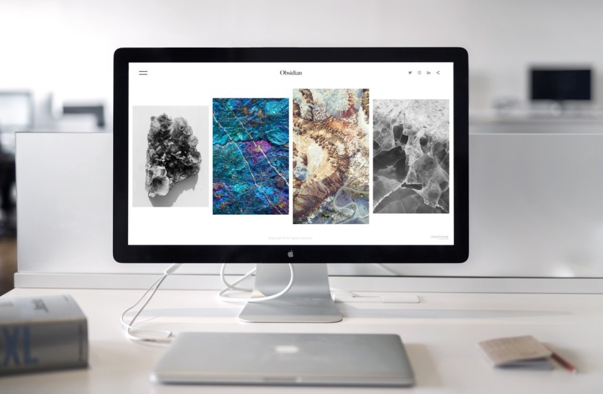
1. The "Card" Design
Platforms like Pinterest took a hint from popular social media apps and began implementing this card design.
Card-based layouts are those that group similar material into one section, a card, and then flesh these cards out in a grid-like style. Each "card" has its own image or text, and clicking it leads you to more details about that particular card-topics pertaining to what it implies.
If you're having trouble getting a visual, just imagine Pinterest's polaroid-esque layout, which features this design element.
Why choose card design?
It groups things together smartly, providing easy navigation. It enhances user experience while promoting responsiveness. It also makes your site supremely scannable-particularly crucial for content-heavy websites.
2. A Thoughtful Color Scheme
With the ability to color-match photos, there's no excuse not to have a cohesive color scheme.
Your color palette should match-so if you have an image in the background, the font on top should harmonize. Programs like Adobe Spark allow you to achieve this color cohesion using an eyedropper tool. Using this tool, click anywhere on a design or photo, and Spark will match that color, adding it to your palette.
This allows you to personalize your palette and achieve your intentions-whether that's something seasonal, celebratory, professional, or playful.
3. Large Font Sizes
How can you display a simple message while nixing the clutter?
By using large font sizes to command attention.
With much of your audience having such short attention spans (it's true), using massive font sizes forces them to pay attention. Something big, bold, and simplistic is a sure way to make an impact on your website design.
Don't believe us? Take a look at some of these pages, which are on the forefront of the large-font trend:
Academy - https://www.weareacademy.com
Carsonified - https://carsonified.com/events/
Digital Mash - https://digitalmash.com/
Visual Box - https://www.visualboxsite.com
One glance at these sites and you immediately understand their message. Don't let yours get lost in the mix-give it a large font and let it tell its story.
Implement These Website Design Elements
That is, if you care about your audience staying hooked on your page!
Whether you're selling a story, a product, services, or a brand, your website needs to reflect a mix of effort and ease. It needs to be equal parts timeless and modern.
That may sound difficult to achieve, but nodding at these three website design elements should help you get started.
For more exciting news like this, keep scrolling our page! See if you can point out some elements we've utilized.
© 2026 NatureWorldNews.com All rights reserved. Do not reproduce without permission.


